Smart Back in Stock Notifier
We will send the plugin directly to your inbox! Important: We only use your email to send notifications if a new version is available.
We will send the plugin directly to your inbox! Important: We only use your email to send notifications if a new version is available.
We will send the plugin directly to your inbox! Important: We only use your email to send notifications if a new version is available.
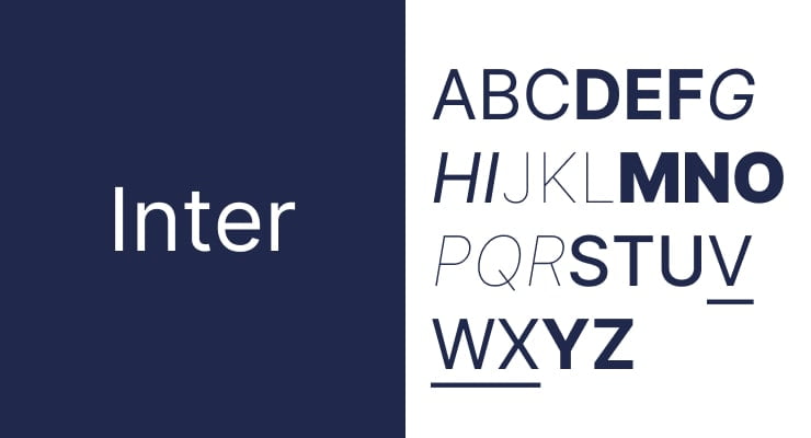
When it comes to web design, I’ve found that the choice of font can make or break the user experience. Among the myriad of fonts available, Inter has become my go-to choice. In this blog post, I want to share why I find Inter so popular, its advantages and disadvantages, how it compares to other fonts, and its use by some major companies. I’ll also touch on whether using Google Fonts is a good idea for your site.
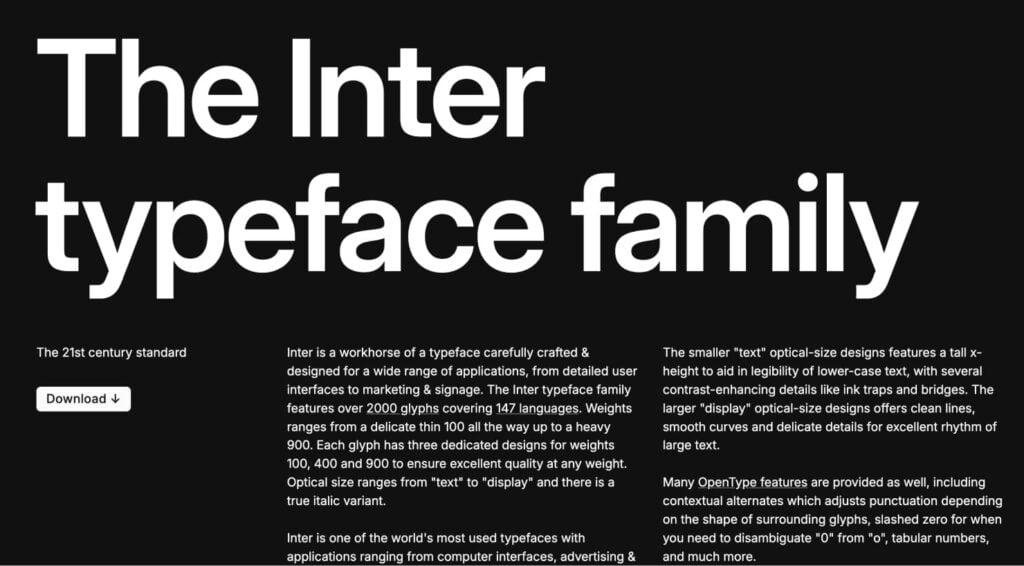
Inter is a sans-serif font family designed by Rasmus Andersson, a Swedish designer and software engineer. Released under the SIL Open Font License, Inter font is free to use and highly versatile, which makes it a favorite for me and many other designers and developers.
Inter was first introduced by Rasmus Andersson in 2016. Andersson aimed to create a font that excelled in readability on digital screens. The development process involved extensive testing and refinement, drawing inspiration from classic grotesque typefaces while incorporating modern features. This blend of tradition and innovation is a key reason why Inter stands out.
Inter’s design includes several technical features that enhance its usability. Its hinting and kerning are meticulously crafted to ensure optimal performance on various devices and resolutions. The font includes a wide array of glyphs, covering over 30 languages and numerous special characters, making it highly adaptable for global use. This technical robustness ensures that Inter remains sharp and legible in diverse digital environments.
Inter is designed with a focus on high readability, especially on digital screens. Its letterforms are clear and distinct, reducing the likelihood of misreading, even at small sizes. The font includes a wide range of weights and styles, making it adaptable for various design needs—from body text to headlines. This versatility allows me to use it consistently across different elements of a website, creating a cohesive look and feel.
Inter boasts an extensive character set that supports over 30 languages. This makes it ideal for global websites and applications, ensuring that text renders correctly regardless of the language used. For someone like me who works on international projects, this is a significant advantage.
Inter is specifically optimized for on-screen use. Its hinting and kerning are finely tuned to ensure that the text looks sharp and clear on all types of displays, from mobile phones to large monitors. This optimization is crucial for maintaining a professional and polished appearance on all devices.
Inter includes several features that enhance accessibility, such as clear distinctions between commonly confused characters (e.g., ‘i’, ‘l’, ‘1’). This makes it a great choice for creating inclusive designs that cater to a broader audience, something that is increasingly important in modern web design.
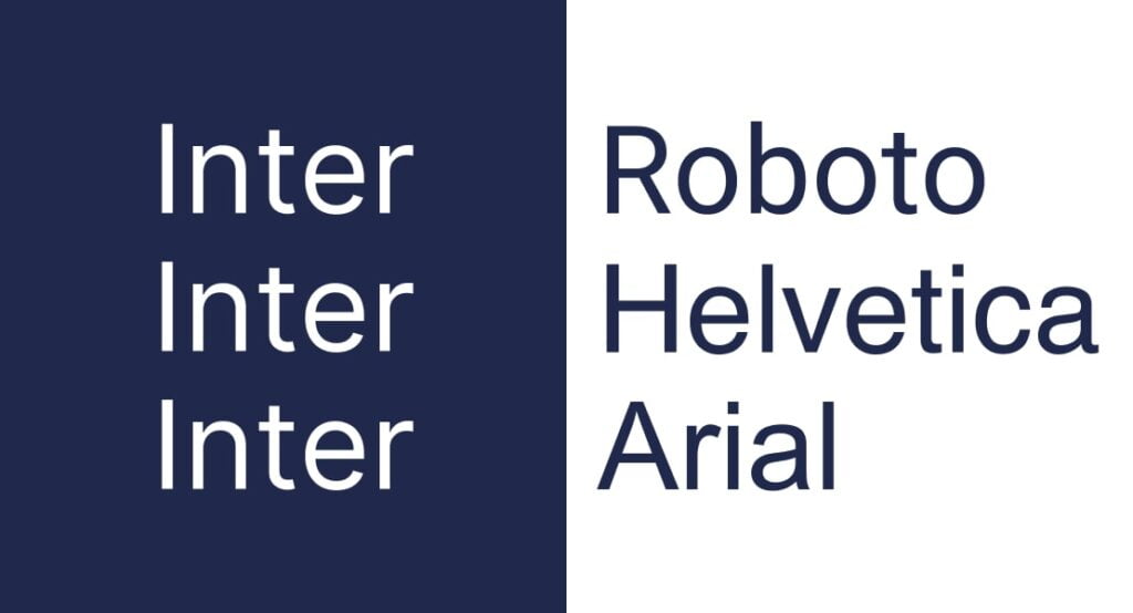
Roboto, another popular sans-serif font, was developed by Google and is widely used in Android applications and Google’s services. While Roboto is highly legible and modern, I often find that Inter wins out in terms of readability and accessibility, particularly in web contexts where small text sizes are common.
Helvetica is a classic font that has been a go-to for designers for decades. However, Helvetica’s licensing can be restrictive and expensive. Inter, being free and open-source, offers a modern alternative that retains high readability and versatility without the licensing constraints. This makes it a more practical choice for many projects I work on.
Arial is a widely used sans-serif font that shares some similarities with Helvetica. While Arial is ubiquitous and familiar, Inter offers a more modern and refined aesthetic. Inter’s design is better suited for digital screens, making it a preferred choice for web design projects that prioritize readability and user experience.
When pairing Inter with other fonts, I usually look for complementary styles that enhance the overall design. For instance, pairing Inter with a serif font like Georgia for body text can create a nice contrast, making headings stand out while maintaining readability. Another great pairing is using Inter for text and a more decorative font for logos or special highlights.
But truth be told… Inter doesn’t even need pairing! This website uses Inter for headlines and body text!
Inter offers a range of weights from Thin (100) to Black (900). For body text, I typically use Regular (400) or Medium (500), while for headlines, Bold (700) or Extra Bold (800) work well. Selecting the appropriate weight ensures that the text hierarchy is clear and visually appealing.
One of the benefits of using Inter is its open-source nature, which allows for customization. I’ve had projects where we needed a slightly different look, and being able to adjust the font’s weight or spacing to better fit the design was incredibly helpful. This flexibility makes Inter a versatile tool in any designer’s toolkit.
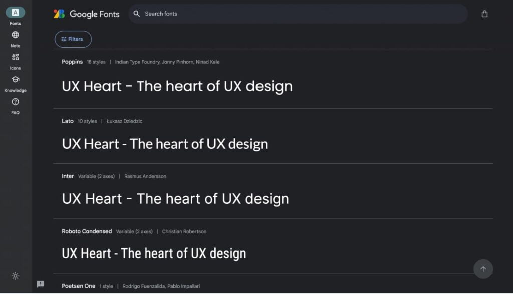
Google Fonts is a popular service that hosts a wide array of fonts, including Inter. Using Google Fonts on your website has several benefits:
Ease of Use: Integrating Google Fonts into your site is straightforward, requiring just a few lines of HTML or CSS.
Performance: Google Fonts are served from fast, reliable servers, ensuring quick load times.
Variety: The service offers a vast selection of fonts, allowing designers to find the perfect match for their projects.
Privacy Concerns: Using Google Fonts can raise privacy issues as it involves fetching resources from Google’s servers, potentially exposing user data.
Reliability: Relying on an external service means your site’s typography is dependent on the availability and performance of Google’s servers.
When using web fonts like Inter, performance is a key consideration. Fonts served from external sources can impact page load times. To mitigate this, I often recommend self-hosting the font files, which gives more control over performance and reliability. Compressing font files and using only the necessary weights can also help improve load times.
Readability: Inter’s design prioritizes readability, making it ideal for content-heavy sites.
Versatility: With a wide range of weights and styles, Inter is suitable for various design purposes.
Accessibility: Features like distinct character shapes enhance accessibility.
Free and Open-Source: Inter is freely available, making it a cost-effective choice.
Overuse: Its popularity means Inter can sometimes feel ubiquitous, potentially making your design less distinctive.
Character Set Limitations: While extensive, Inter’s character set might not cover all niche typographic needs.
Several high-profile companies have adopted Inter for their websites, showcasing its versatility and appeal
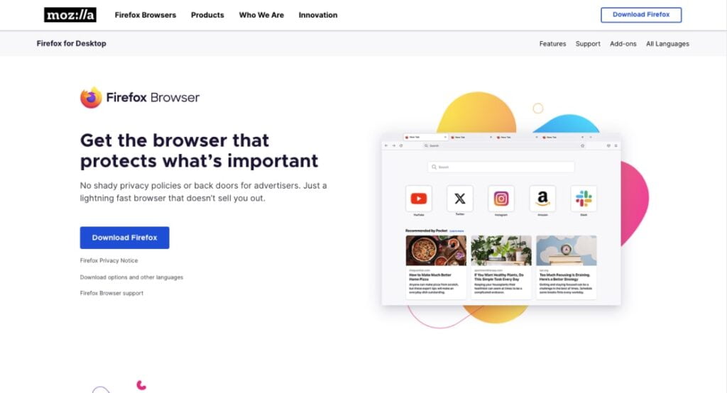
Mozilla’s use of Inter exemplifies how the font can enhance clarity and user experience. By utilizing Inter across its website, Mozilla ensures that all content is easily readable, contributing to a user-friendly browsing experience. The consistency in typography also helps reinforce Mozilla’s brand identity.
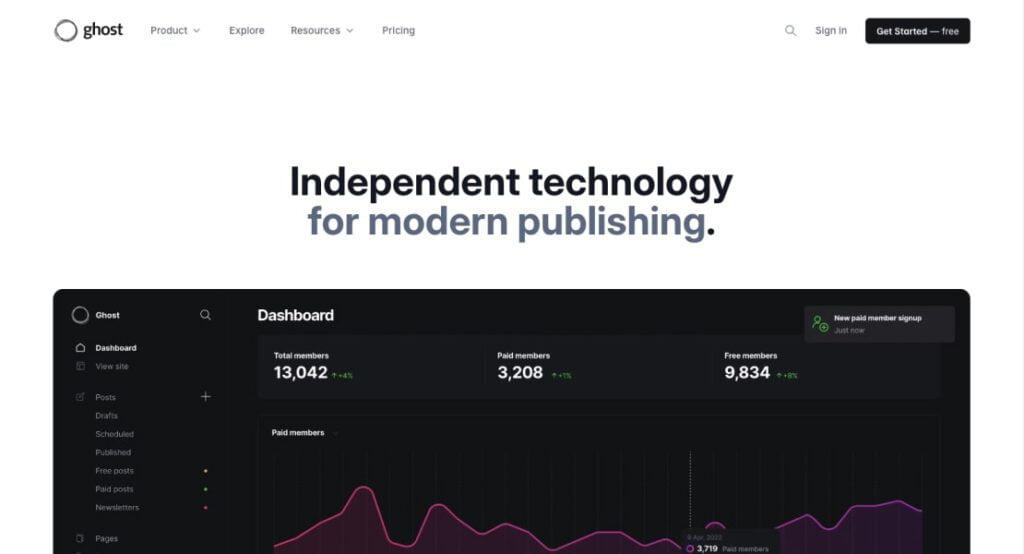
Ghost uses the Inter font to keep things simple and readable on its publishing platform. This clean, modern font fits right in with Ghost’s minimalist style, making it easier for readers and writers to engage with content. It’s all about making the experience as smooth and pleasant as possible for everyone involved.
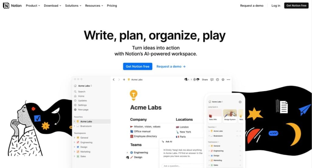
Notion’s use of Inter reflects its emphasis on productivity and ease of use. Inter’s clean and simple design supports Notion’s goal of providing a seamless user experience. The font’s readability is crucial for users who spend long hours working within the app, ensuring that text remains legible and comfortable to read.
Inter has solidified its place as a favorite among web designers due to its readability, versatility, and accessibility. Its extensive character set and optimization for digital use make it a reliable choice for a wide range of applications. While there are some drawbacks to its widespread use, the benefits often outweigh the cons, especially for content-heavy and inclusive design projects.
When considering font choices for your website, Inter stands out as a modern, practical option. Whether you choose to use Google Fonts or host the font yourself, Inter’s performance and accessibility features make it a robust choice for enhancing user experience.